Are you powered by green energy ?
Could electronic device icons help us visualize green energy from the local electric utility ?
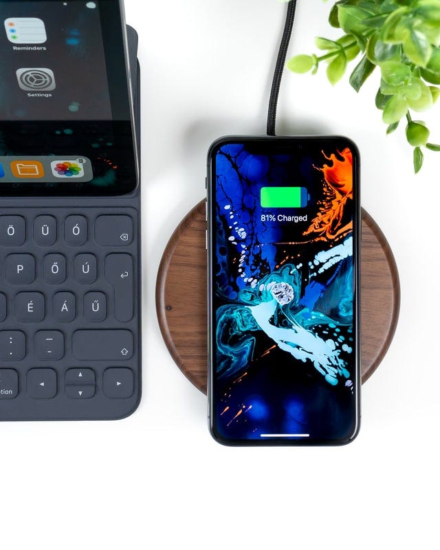
The battery icon is a globally familiar sign which lets us know the level of charge in our portable electronic device. Could such icons possibly convey more information about the environment around us ? Let’s explore more.
The Problem
Currently there are limited ways in which an electric utility can convey the data related to the energy composition used for generating and transmitting electricity. Specifically the percentage of green energy sources like solar, wind utilized for generating electricity. As a result consumers are disconnected from how the electricity was produced as they go through daily activities.
As consumers become increasingly climate conscious, the focus on energy efficiency is gaining importance. If there is a way to convey in near real-time the energy composition data in terms of percentage of green energy supplied by the utilities to the consumers, consumers demand could eventually shift and align with time period when more green energy is generated at the grid than when grid is mainly supplied by fossil fuel based sources like coal.
Motivation
Currently green energy is mainly sourced from renewables like solar and wind , where the generation capacity is unpredictable in nature. At the same time when the consumption of energy suddenly increases, to cater to the peak demand utilities rely on peaker plants ,which in turn heavily relies on burning fossil fuels like coal to meet this urgent need. Such sources are costly and utilities transfer this cost to the consumers with methods like time-of-use electricity pricing.
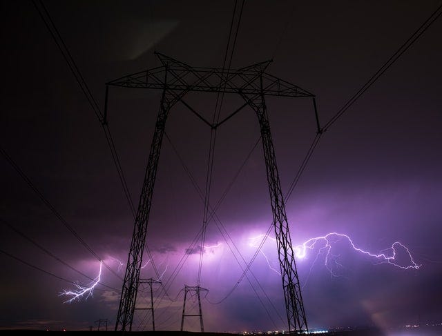
Time-of-use electricity pricing may incentivize the consumers to shift the demand to time periods when the cost of generating electricity is cheap, specially when green energy generation capacity is at its peak , hence helping consumers save on electricity bills. This demand shifting also helps the energy utilities to balance the grid by spreading out the peak load.
A picture is worth a thousand words, in this story let us explore if a visual method could effectively inform the consumers of the energy composition at the grid promoting timely action in terms of demand shifting to off-peak hours. Visualizing the amount of green energy consumption whilst using electronic devices like smart phones, laptops , tablets etc.( most popular electronic devices ) opens up possibilities where consumers are aware of their own carbon footprint whilst going through every day activities.
Mobile phone usage and charging
A decade back, the collective annual electricity consumption of just the iPhone 5’s sold within 12 months was equivalent to the annual electricity usage of 54,000 US households.

Fast forward to 2022, the number of smartphone users in the world is 6.648 Billion, which translates to 83.72% of the world’s population owning a smartphone. In total, the number of people that own a smart and feature phone is 7.26 Billion, making up 91.54% of the world’s population.
Energy requirements of operating smartphones go far beyond charging the smartphone itself. In particular, smartphones have driven a huge internet traffic over past decades with video streaming services , online gaming etc. With advent of new technologies like 5G, demand for faster internet speeds is set to grow in coming years and so is the energy consumption.
The battery icon in smartphones , tablets, laptops is almost a global symbol signifying the level of charge in the device ( with few variations). Could an additional dimension like color help intuitively communicate the availability of green energy composition at the local electric utility ?
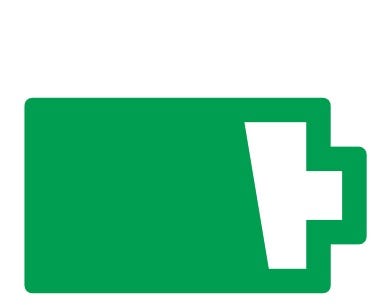
If we imagine the battery icon in the mobile phone as the visualization point of conveying the energy composition at the local grid, it could inform the consumer when to go for heavy usage /charging so that overall demand from the energy / cost conscious consumers shifts towards a time when electricity is cheap and powered by renewables. The icon color ( green is an example used to convey the message of green energy ) is linked to the dynamic energy composition data at the the local electricity utility and is based on availability of the renewable energy at the specific location and in near real-time.

The more conscious users can now choose to shift the usage / charging of the smartphones to off-peak hours or when the local utility is powered majorly by renewables.
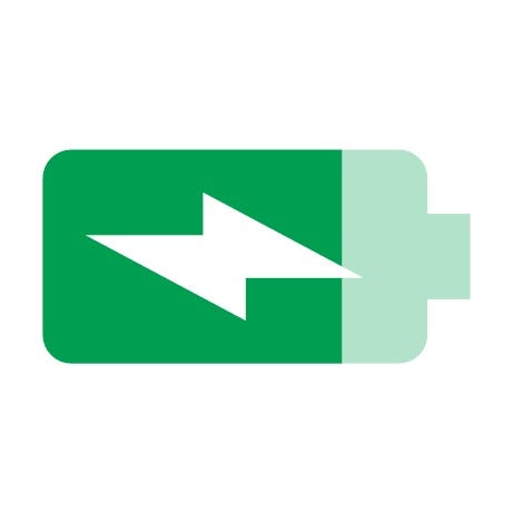
Similar advanced icon ideas could help inform a predicted or scheduled time when a better energy mix with green energy is likely to be generated or when the time-of-use electricity price is lower , helping inform the consumer in time to make a choice about shifting the demand.
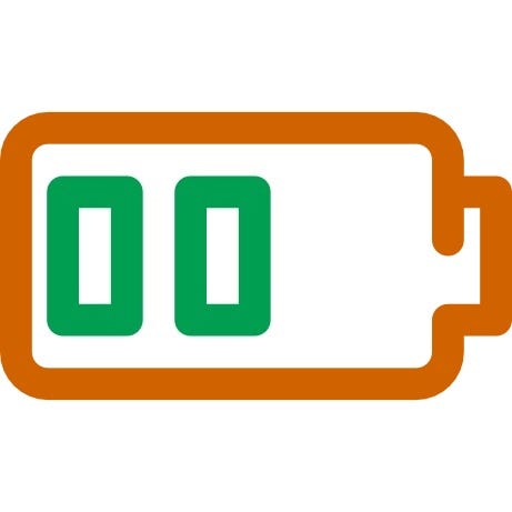
Color within the battery could further convey deeper meaning in terms of how much green energy was used to charge the device.

Laptops / Tablets

The charging icon remains the similar in laptops or tablets as the smartphones. Hence the above icons could help prompt the users unplug the charging cable when fully charged especially when there is peak load at the electric utility or when significant fossil fuels are being burnt to produce electricity. The icon could further guide on when to plug the charging cable or go for heavy non-critical data usage like scheduling downloads or streaming.
Above illustrations are just examples of how a simple icon like battery could be potentially utilized to convey deeper meaning in terms of users carbon footprint. With similar subtle indicators, consumers could be made more aware of the energy consumption with usage of personal electronic devices hence prompt conscious action to eventually shift the non-critical demand to a time when electricity prices are cheaper and powered mainly by renewables.
Future devices
Electric vehicle ( EV) dashboards could be another important area where consumers are made aware of the peak load conditions in the area so a user can plan EV charging accordingly.

There are some scenarios where charging may not apply like smart TV or scenarios where charge related information may not displayed up front like AR/VR devices. Here other innovative methods could be employed, like notifying whilst switching channels or turning on the device etc.

Possible method of realization
To realize such a near real-time integration between the battery icon display and the electric utility data, device operating system (OS) vendors ( like Android , iOS etc. ) will need to develop support so the icon reflects the local electric utility published data as illustrated with examples above. All electric utilities will need to securely publish the green energy data in near real-time towards a common service from where the device OS / apps can subscribe to this data and reflect the change in the icon displayed. Sustainability will depend on equal participation / support from both OS vendors and electric utilities .
Entire world is now connected with electronic devices. Icons like battery established a common basic sign to communicate the level of charge in a electronic device. Is it time now to communicate more complex environmental status leveraging the established basic signs like a battery icon ? Initially this may seem insignificant but its important that we experiment and see the results.
“Whatever you do will be insignificant, but it is very important that you do it.” — Mahatma Gandhi
As users become more aware of individual consumption pattern, collectively the major demand for energy will shift to time periods when there is more green energy available, helping electric utilities to balance the grid during peak hours at the same time reducing the energy bills towards consumers. This will help power a future with green energy.
